Jayme Rossie

 
Artworkork by Jayme Rossie
Slide 1 of 9

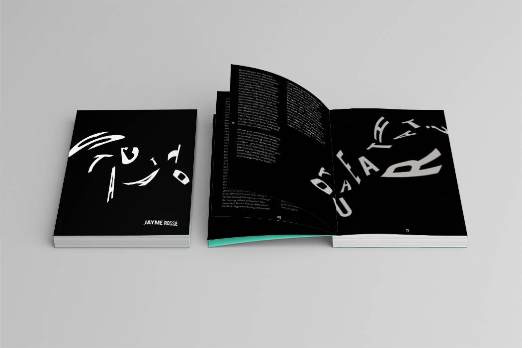
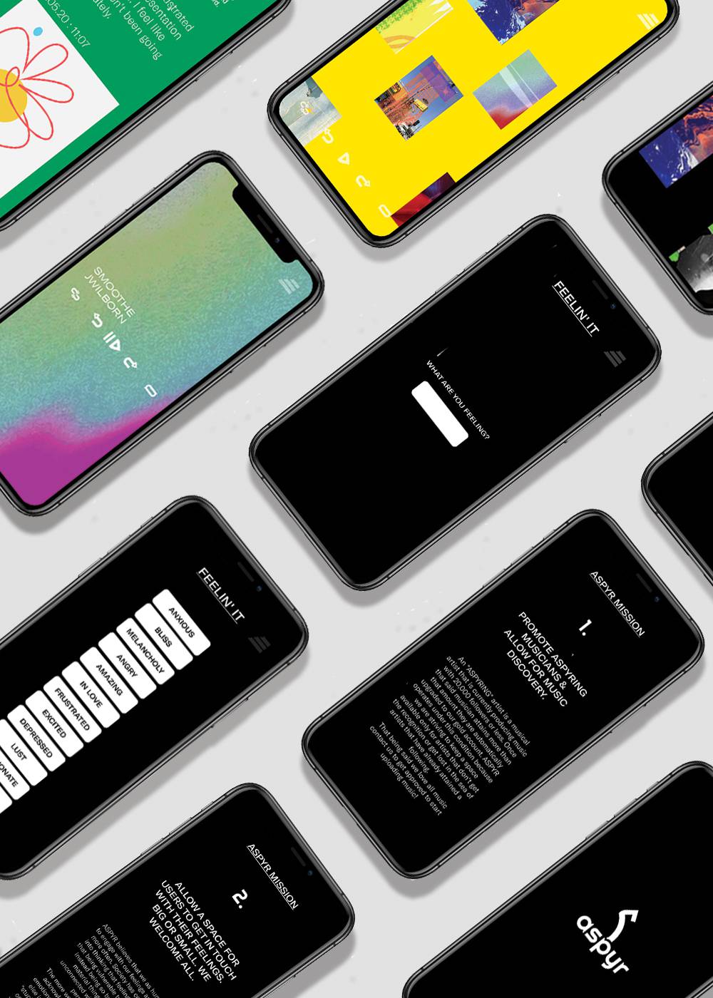
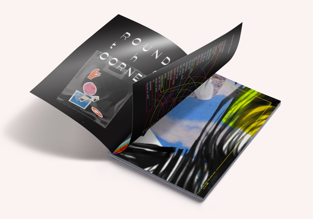
Hi, my name is Jayme Rossie. I’m a graphic designer based in Los Angeles. I graduated from Otis College of Art and Design with a Bachelors of Fine Art in Communication Arts with an emphasis in graphic design. I specialize in branding, illustration, motion graphics, and pattern design. I was trained in the following programs Adobe Suite (Illustrator, Indesign, Photoshop, After Effects, Premiere Pro), Figma, and Invision. I love collaboration, I adore typography, I always incorporate hand elements in my design process, and I am oh so intrigued with film photography.


107 DEGREES is the first part of my Manifesto Project - an inkjet-printed zine comprised of mixed media images regarding the way in which I think and design. Not only does this zine illustrate how I design but also pinpoints what I believe we as designers and humans need to work on as a whole encouraging the viewer to do better. And to be better. The name “107 Degrees” stems from the concept that I believe we need to be uncomfortable in order to grow and enhance our mindset. And sometimes to achieve that feeling of uncomfortable we need to light the fire beneath our feet so we have no choice but to soar.


Los Angeles is the city known as the driving city the world’s most congested city. As we look into the future, we have the concerns of global warming, gas consumption, and the increasing population therefore with this project I was beginning to tackle the issue of public transportation in Los Angeles. Currently, at bus stops in Los Angeles, the signage consists of a tiny sign that lists which bus it is and which direction it is going. But if you are standing across the street or at a far distance it is impossible to read unless you are a couple of feet away from it. This brings up the question “How can we use typography and signage to increase the use of the bus system in Los Angeles?” In the project POINT A TO POINT B, I researched public transportation in LA as well as the effects of kinetic typography and designed signage that will disrupt your typical typography and advertisements throughout the city by using kinetic typography. I believe changing the signage and creating snarky environmental designs plastered on buses will not only encourage people to jump on the bus rather than drive but also make it easier for passengers to understand the Los Angeles bus system.

GAUZI is a cannabis company focusing on the connection of specific strains to certain incense and music in order to create a very specific environment and atmosphere. Our motto is “We Matter”. When I say “We” we are referring to you. This product is all about you, we want you to have the best high you possibly could want. That being said we believe these are the things that matter in order to achieve that perfect high experience. 1. Cannabis Growth 2. The Profile of the Strain (Terpenes, Cannabinoids, Sativa, Hybrid, Indica). 3. The Aura - The Incense Pairing 4. The Rhythm - Genre of Music and 5. Your desired experience! And light up & Enjoy!


Staccato is a book about some topics that influence my way of thinking in life as well as in design. This book is not solely about design but rather how I approach life there are sharp transitions between each point. My brain leaps and dances between subjects rather quickly or at the slowest of paces. Playing right in the in-between of chaotic passion and boredom. One moment I am diving in headfirst and the next it is a dream I have slight glimpses of or nothing at all. To find the entire publication visit my website!

ASPYR MUSIC is no ordinary streaming platform. We have a few key features that set us apart from the competition. (**in no particular order**) 1. Only Aspiring Artists 2. Feelin’ It Prompts - Enhancing Emotional Intelligence 3. Abstract Animated Videos to go with each song to encourage introspection and your own interpretation. 4. A thoughts page where the user is able to write and or draw what they are feeling. and 5. Music discovery! ASPYR’S mission is to promote “ASPYRING” musicians allowing for music discovery and to create a space for users to get in touch with their emotions. Big or small. We welcome all!

“ Healing Begins”is an animated video based on a piece of jazz music “119” by TJCK. This piece is connected to ASPRY MUSIC (previous project) as it is one of the abstract animations I created based on the emotion and feeling of the song itself. The intention of this piece was to leave room for the viewer to interpret whatever they are feeling. It is made with risograph texture, collage pieces, illustrations, and animation.  Find the whole video as well as more info on the musician on my website!

Round the Corner is a concert series promoted/sponsored by Aspyr Music. This publication is about the concert itself and is filled with hand-selected musicians from Aspyr Music and range in their style of sound and visuals. Round the Corner wants the experience and path to be entirely up to the viewer which is why I designed multiple entry points and added suggestions as to what page to flip to next. I encourage you to open the book from all different places in order to experience all the different journeys. To us, music is a very individual experience and we want to remind you to feel whatever you are feeling, understand it, learn from it, and see where it takes you. Head over to my website to view the whole brand!

Henrietta was designed in December 2019. The concept behind this typeface was that I really wanted to play with high contrast. As you can see in both the thin and thick lines as well as in the width of each letter. In this font family, the uppercase letters are extended while the lower case is condensed. My intention behind the extended and condensed was to show flexibility as well as emphasize the versatility of the typeface. Lastly, the pointy slab serif attached to the thin lines of the letters creates a nice balance to the typeface. Henrietta is a typeface mostly used for titles and headings as she is too sassy and all of her little details get lost when used for body text or anything lower than a 24 pt. She is sassy, bold, happy, dangerous, ambitious, but also delicate, dainty, and shy at times.

Screen Printed Patterned Poster with bright colors and illustrations. This piece is meaning to express a feeling of contentment or joy. Head to my website to see the more details or to purchase!