

Hello, my name is Hana Ishijima and I am a graphic designer graduating from Otis College of Art and Design in May 2020 with a Bachelor of Fine Arts in Communication Arts. I have developed my professional background through three design internships and freelance projects for the past two and a half years. I am experienced in editorial and print design, publication design, visual identity/branding, and typeface design. I am well versed in Adobe InDesign, Photoshop, Illustrator, After Effects, Glyphs App, and Figma. I am a designer passionate about typographically-driven visual languages and systems-oriented designs. I strive to create conceptually-driven, sophisticated design solutions that push the field of graphic design.
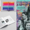
Chameleons is a three-part project about the joys and complexities of being biracial. It centers on five women’s thoughts on embracing their fluid identities and living with ambiguity. The three components are a publication, an Instagram page, and a promotional poster. I was interested in learning more about the profound impact being mixed-race has on identity formation and sense of belonging within communities. I intended to communicate that being mixed-race is a layered experience that cannot be reduced to binary social constructs. These pieces serve to celebrate biracial identity, connect biracial women, and strengthen the biracial and broader mixed-race community.
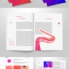
Disposed is an interactive magazine series with QR codes that link to text messages and a curated Instagram page with motion pieces, photo series, and typography. This campaign addresses the disillusionment of modern love as it’s increased digitization has caused dating to feel disconnected and disposable.
Intropia is a fictional Utopian society designed for the well being of a highly concentrated introverted population. I designed a visual identity system that included several applications including an interior relaxation space mockup, a zine format personality quiz that helps determine your type of introversion, postage stamps, currency, essential oil packaging, and a mockup for an app to help people become acquainted with Intropia’s origins and lifestyle. By developing a soothing color palette that utilizes gradients and treating imagery in an ethereal, otherworldly manner, I was able to capture the spirit and essence of introversion across the visual identity.
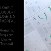
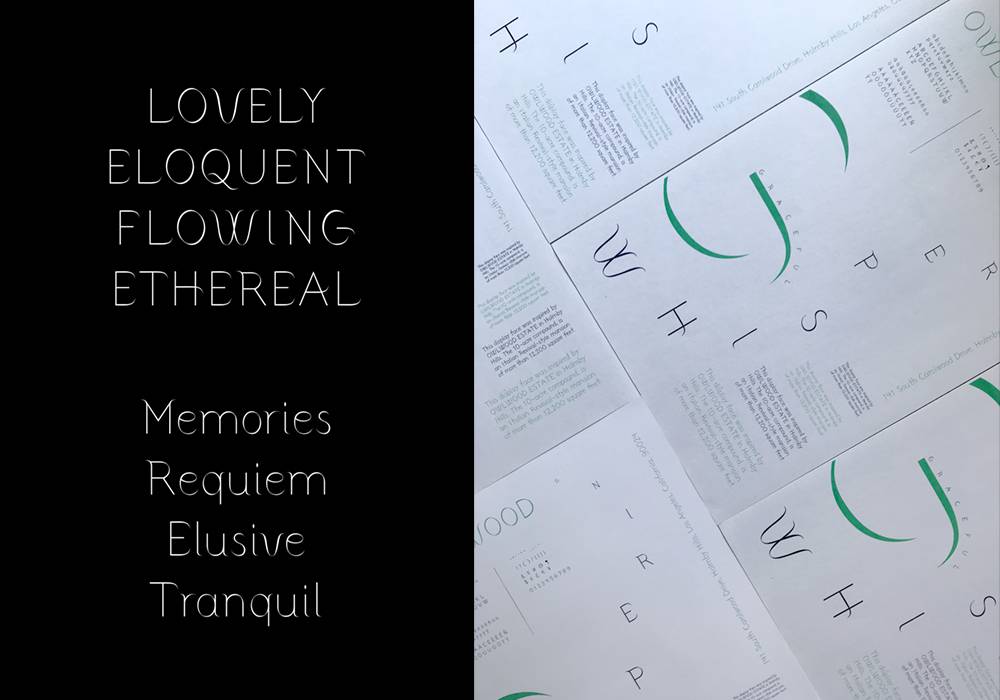
Owlwood Display is a typeface inspired by the Owlwood Estate in Holmby Hills, Los Angeles. The mansion’s architecture is extremely elegant and ornate, which I tried to capture the essence of in my design. I designed this typeface using Glyphs App and it consists of uppercase, lowercase, Latin, numbers, punctuation, and select symbols and currency.
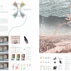
I was given a trace of a pre-existing identity to deconstruct. Using an iterative and layered process, I generated a new identity system using an invented kit of parts.
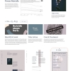
Left Behind is a desktop and mobile website on the topic of suicide and suicide prevention. Using Figma, I strategically utilized a lot of white space and asymmetry to give users a sense of quiet safety. Additionally, I strove to present the content in a sensitive and respectful manner.
Asian Voices is a website archiving Los Angeles theatrical productions featuring Asian casts and/or themes. My design solution involved using a limited color palette and developing multiple modes of interactive navigation through the site.

